Illustrated history of MLS crests: Part I

With Chicago’s recent rebrand announcement receiving a, shall we say, openly hostile reception, we’ve gotten to talking about soccer logos in the Soc Takes group chat. It’s a common pastime for us, much like any other members of #SoccerTwitter, and this got me thinking about the various brands and rebrands we’ve seen in MLS since its inception in the mid-’90s. MLS itself has gone through a handful of different logos in its history, before settling on the current design in 2014.
For this mini-series, we’ll be going through MLS teams in a quasi-chronological order, starting with the original Class of 1996, continuing with the teams launched between 1997 and 2010, onto the latest batch of expansion that began with New York City and Orlando in 2013, and wrapping up by looking at the latest logos to be revealed for the teams yet to enter MLS.
Illustrated history of MLS crests
Major League Soccer

We begin back in 1994. The World Cup had finally come to the United States, and with it, the requirement from FIFA for a top level professional league. As excellently documented by Beau Dure in his book “Long Range Goals,” MLS won the bidding by USSF to become that league, and launched in 1994 with 10 teams ready to go, and another two just a few years away. The league adopted a logo inspired by those of the NBA and MLB, with a red, white and blue color scheme and a relevant athletic silhouette, but this logo would be scrapped before the announcement of the inaugural 10 teams.

MLS instead adopted a unique blue and green palette, a simple color swap of the original logo, setting the tone for their branding for the next two decades. This was the logo used at the public reveal of the founding markets and teams, and was carried over for the league’s first three seasons. While MLS was originally slated to kick off in 1995, a few operational delays forced the start back one year, with the league deciding that it was better to have a well-organized, well-prepared launch than to rush into things.

For the 2000 season, much like nearly every major brand on the planet, MLS updated its logo for the Information Age™, adding more detail and shading to the boot and ball along with a thick black outline. An alternate logo, missing the “MAJOR LEAGUE SOCCER” wordmark, was also used, particularly online and in graphics. This fundamental design would prove to be the longest lasting branding used by the league.

The next revision was even subtler, simply adopting the previous alternate logo as the league’s new primary branding, carrying over the same fundamental idea for another seven seasons.

In September 2014, MLS unveiled a complete redesign of all its branding, adopting a new primary crest and numerous palette-swapped variants, with one for each member club. The new logo also launched the wonderful trend of PR-speak branding guidelines, stating that the three stars stood for club, country and community, and the upward sloping line representing MLS’ pathway into the future. Onward and upward, literally.
Colorado Rapids

The Colorado Rapids launched with a very ’90s brown and blue color scheme, and a logo that more resembled a minor league baseball team than professional soccer. This would end up being among the longest-lived brandings for the original 10 teams, with only New England’s controversial flag and Columbus’s hard hat trio lasting longer.

For 2000, the Rapids made some subtle tweaks to their colors, settling on new shades of gold and blue. They also began to make more frequent use of a roundel secondary crest, though it was never considered a primary brand.

Colorado’s only substantial overhaul settled on their still-active primary brand in 2007, adopting a completely new color palette inspired by the other Kroenke-owned Denver-area sports teams, and brought the Rapids more in line with conventional soccer aesthetics.
Columbus Crew

Much has been said about the Crew’s original logo. References to The Village People, attempts to identify the three men pictured, the adoption of hard hats as fan ware, you name it. It never featured the city in which the Crew played, and even referred to them by “the Crew.” Peak 1990s aesthetic.

Considered by me to be the only positive lasting contribution made by former investor-operator Anthony Precourt, Columbus adopted a roundel design in 2014 as the first major change to their visual identity. Also changed were the shades of black and gold, with a much brighter yellow made the primary color and the shade of black set as a very dark shade of grey. It’s honestly still one of my favorite logos in MLS, and there’s a reason that the new owners haven’t touched it.
Dallas Burn/FC Dallas

“OK guys, we’ve got to figure out the branding for this new Dallas team. What’s iconic about Dallas?”
“Well, they ride a lot of horses in Texas, right? How about something with a horse?”
“Genius! But it’s 1995, baby, we need to be modern! Hip! Edgy! With it!”
“Well, it’s hot as hell in Texas, so what about the Burn? Because stuff that burns is really hot! And maybe the horse is breathing fire!”
“Perfection! You’re getting a raise, kid. No, a promotion!”

By the summer of 2004, the Burn had broken ground on a new stadium in the suburb of Frisco, and as part of the move to their own purpose-built home, the team completely rebranded. Gone was the name, Burn, and with it, the fire-breathing horse. Dallas needed something that screamed soccer, and Texas, and what better than to simply call the team FC Dallas and feature a Texas Longhorn cow on a red, white and blue shield? While the logo received a lukewarm reception in 2004, it’s proven decent enough and still holds up alongside the latest and greatest offerings from around the league.
Fun fact, the team has never settled on standard shades of red or blue.
D.C. United

D.C. United’s original logo drew immediate comparisons to totalitarian symbolism. There’s nothing wrong with using an eagle as a prominent symbol, but the way they went about it felt more-than-vaguely fascist. Apparently, the criticism worked, because after just two seasons, D.C. gave it another go.

Ah, much better. While the general idea remained the same, D.C. opted for a much more American take on an eagle motif, and adjusted the crest’s shape and typography to look a good bit cleaner. This would end up lasting almost as long as RFK Stadium, and D.C. won the bulk of their trophies with this crest on their jerseys.

As ground broke on D.C.’s forever home, the team once again changed hands, and decided to update their crest as it entered a new era. The basic idea of the eagle with outspread wings stayed, but with a much more modern design, a brand new and really rather lovely typeface, and a nod to the District’s amazing flag across the eagle’s body. As far as I’m concerned, they nailed it here.
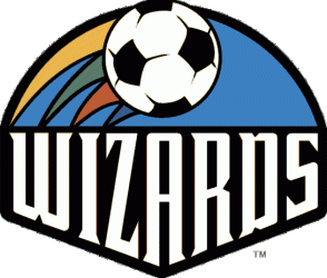
Kansas City Wiz/Wizards/Sporting KC

This was Kansas City’s actual name and logo at their launch, straight out of a Zima-fueled bender in 1995. It’s amazingly terrible, and I unironically ironically love it. Soon after the team’s debut, there was a bit of a friendly rivalry with their neighbors to the south, with plenty of definitely subtle references to sexually transmitted diseases. Wiz vs Burn, anyone?
Kansas City lengthened Wiz to Wizards for their sophomore season, thanks in no small part to threats from the now-defunct “The Wiz” electronics chain, and stuck with it for over a decade. The uber-vivid colors were muted a touch, but the flashy magic rainbow aesthetics remained core to the team’s visual identity well into the 2000s. I still can’t believe that this actually happened.

In 2007, as MLS entered the Beckham era, Kansas City decided they needed to update their branding as well, but rather than ditching the delightfully absurd Wizards moniker, they merely de-rainbow-fied themselves. This would last a few seasons longer than the original Wiz idea, coinciding with the team’s move from the colossal Arrowhead Stadium to an independent league ballpark in the suburbs.

Fortunately, Kansas City was sold to committed and savvy new investors in 2007 who had big plans for the team. A new stadium, a new name and, of course, a new logo. They chose Sporting Kansas City, initially as part of a united “Sporting Club” that ultimately never came to fruition, but gave the team a fantastic logo that still ranks among the best in MLS.
LA Galaxy

What the hell were people doing in the ’90s, honestly? I get the idea of Galaxy for Los Angeles, it’s a cluster of stars, and the spiral galaxy motif makes some logical sense, but the Galaxy were one of the more aggressively ’90s-tinted teams. This design would actually last for over a decade with only a minor adjustment to the colors.

They actually managed to take their goofy design and make it worse, with a less attractive shade of green. Fortunately, they soon figured things out, decided to act like a big-time LA team, and made a few changes that would define the team for the next decade and change.

How do you achieve relevance in a crowded, competitive and often fickle sports market? For the Galaxy, they built a new stadium, signed David Beckham and Robbie Keane, and adopted a logo that was in no way derivative of Real Madrid. Long before adopting this crest, LA had made the diagonal sash their look, and with the bright new logo and color scheme, the white and blue came to symbolize success and fame in MLS.
New England Revolution

There are times where a team gets their branding right the first time, and never needs to change a thing. This is not one of those times. Even back in 1996, New England’s logo was mocked, likening it to a crayon drawing. Little has changed on either side, with the team merely adding/removing the wordmarks as needed and slightly tweaking the palette, and the fans and pundits continue to point out how bad it looks. Team leadership has said that they’ll rebrand when they open a stadium of their own, but even that’s been in development hell for over a decade. We’ll see if they ever actually do either.
New York/New Jersey MetroStars/MetroStars/New York Red Bulls

Would a team by any other name still get acknowledged as playing in New York City? Apparently not, but they still tried. The New York/New Jersey MetroStars, slash and all, were the original NYC representatives in MLS, featuring a name inspired by the team’s original owners, Metromedia. When people point out that they’re so blatant about their corporate ownership, just point to that fact and say it’s always been like this.

Oddly enough, though, the MetroStars name resonated with fans, and even after dropping any geographic marker in the name, the MetroStars brand lasted quite a while. A vocal minority even prefer this era’s branding to the current Red Bulls era. And for any Atlanta fans reading this, the MetroStars were the original Five Stripes, red, black, gold and everything.

Can you guess who bought the team in 2006? I’ll give you three hints. They’re a major energy drink company based in Austria, they’re inspired by a famous Thai energy drink named after a crimson cow and they’re well known for their involvement in the more “extreme” side of sports.
Red Bull were unbelievably blatant and coarse with their changes after taking control, completely erasing the MetroStars history, and stamping their corporate logo on everything, much to the chagrin of longtime fans.

When Red Bull updated their corporate imagery in 2008, they applied it to their various sports properties, RBNY included. The updated logo toned down the “extremeness” of the bulls, simplified the sun design in the center, and darkened the color palette. This same branding would be applied to the team’s new stadium, to be known as Red Bull Arena.
That said, there’s been some talk of Red Bull selling the stadium and/or team in the near-enough future, so maybe this logo won’t be around in a few seasons.
San Jose Clash/Earthquakes

Part of the inspiration behind the launch of MLS was a step away from the mistakes of the NASL. The league made a concrete effort to avoid reusing branding and to make it crystal clear that they weren’t going to be a repeat of the past. This meant that the iconic San Jose Earthquakes name was passed over in favor of a new idea, which for some reason involved scorpions. I don’t know, blame Nike.

Another idea proposed by the team’s original owner was a continuation of the San Francisco Bay Blackhawks, a team founded in 1989 following the folding of the original Earthquakes. The Blackhawks became one of the rare powerhouse teams of the late ’80s and early ’90s, producing a number of USMNT players and notably advanced into the second stage of the 1992 CONCACAF Champions Cup, before falling 4-3 to Club America. Unfortunately, Blackhawks/Clash owner Dan Van Voorhis had some financial and legal trouble that saw him hand his MLS team back to the league before the league officially launched.
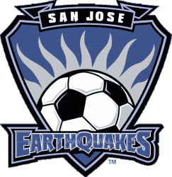
In 2000, with the team under control of the former owner of the NASL Earthquakes, the Earthquakes name was revived with a new blue, black and white scheme. This proved to be much more popular with fans, both those who remembered the original team and newer fans who hated the Clash branding. The team quickly went on a tear, winning two MLS Cups with the new name and logo.

The Earthquakes logo received a fresh coat of hex color codes for 2005 and proceeded to storm to their first Supporters’ Shield, but off the field, owners AEG had other ideas. At the end of another successful season, the team packed its bags and moved to Houston, with the promise that MLS would return to San Jose in a few years once the situation was better.

Following two seasons where the former Earthquakes won two championships in a different city, MLS brought the Earthquakes back from the dead with new owners, a new home and new logo. These revived Earthquakes won another Supporters’ Shield and saw the rise of Chris Wondolowski as the face of the new era, alongside plans for a proper stadium for the future.

As the Earthquakes broke ground, at long last, on their new dedicated stadium, the team followed in the footing of recent MLS trends and rebranded to mark a new era. Strangely, the name Earthquakes was abbreviated to simply Quakes, even though a matching EarthQuakes wordmark was created and has been used by the team. The new crest received a lukewarm reception, mainly stemming from the abbreviation, but has lasted through six seasons and revived interest in the team.
Tampa Bay Mutiny

MLS owned and operated the Tampa Bay Mutiny for all six seasons of the team’s existence, all under an unusual video game and sci-fi-inspired crest featuring some strange mutant alien creature that Nike claimed would control the ball with its mind. Sadly, the team’s move to Raymond James Stadium in 1998 came with a rather horrid lease, and attempts to convince Malcolm Glazer to buy the team failed, with him instead deciding to buy a community team in northern England, and MLS decided after the 2001 season to fold both Florida teams.
* * *
This concludes Part I of this comprehensive look at the history of MLS crests and branding. Part II picks up where we left off with the two expansion teams from 1998, and continues through the teams announced by 2011. Part III will then begin with New York City FC and Orlando City SC, and continue through the present.
As always, a massive tip of the hat goes to Chris Creamer and SportsLogos.net, one of my favorite resources for sports design history. If you’re at all curious about the history of branding in sports — and judging by the fact you read this far, you are — go check the site out.
And if you like this sort of stuff, check out a piece that inspired the escalation of my original commentary on the Fire’s new branding, written by Buzz Carrick over at 3rdDegree.net two years ago.
Follow John on Twitter: @JohnMLTX.
Support Soc Takes on Patreon for access to exclusive content and supporter benefits. Click here to become a patron today.


